About Me

My photo
Welcome to 22 Revisions - a blog documenting what I do at work and in life... I’m Sacha and I’ve been in the advertising business for 22 years. In the summer of 2008, I moved my family from Cambridge to a little city north of Toronto called Peterborough to work at an advertising agency called BrandHealth. It has been challenging and unpredictable but the most important revision I have ever made. I am definitely not the most dedicated blogger, nor the most interesting person that has blogged but I hope my sporadic blogs provide some insights into this amazing city, company, industry and people I work with...

Wednesday, September 30, 2009

Identity Inspiration

Here’s a great site for logo inspiration...http://logopond.com/
You will find over 58,000 logos on this site and they will all inspire you! What makes these logos so fantabulous? Well, if I remember correctly from art school...


Basic elements that make a good logo
Here are a few elements that can be seen in every great logo:
The first on my list and the one I work the most on is... it’s appropriate and it represents the brand. The design must be appropriate for the business or service it identifies. This is accomplished through hours of research and understanding the brand, it's industry and competition.


It’s effective without colour - colour is secondary to the shape and form. I always leave colour to the end of the design process, because if the logomark doesn’t work in black only, no amount of colour will rescue it.


It’s describable and memorable or unique - because if you can’t describe what a logo looks like then how will you be able to remember it? It has to be unique to differentiate the brand from competitors.


It’s scalable i.e. works when just an inch in size - is vital for collateral, such as office stationery (pens, pins, hats etc.) — all those little things that can easily be overlooked.


Have your say
Perhaps there’s another factor that I might have forgotten... let me know!

Monday, September 21, 2009

Your PowerPoint file size has spiraled out of control and you can't figure out why?

After consulting Steve Rindsberg, Microsoft MVP and co-creator of PPTools, I have learned a few tips and tricks to keep your PPT file sizes manageable. We're quickly going to look at why it happens, how you can fix it, and what you can do to prevent it from happening again.


For all the PowerPoint shows that we create most of our file weight is coming from the images that we import and how we import them.


Watch out for oversize image files
In most cases, images don't need to be much larger than 1024 × 768 pixels at 72 dpi. If images are larger than this, your PowerPoint files are probably bigger than they need to be. 


Save images as jpegs for maximum compression. Set the quality level to 10 when the Jpeg Options box pops up. If you need transparent images – for example a logo to place on a background – use a transparent gif as your first option PNGs also work but can increase your file size if there are many of them.


How you import images can decrease file size, believe it or not.
If possible, bring images into PowerPoint by doing the following: From the Insert menu, go to Picture, and then import your file. Copying and pasting or dragging images into your files can make your files quite large. (Click on the images below to magnify.)


If you have a series of similar backgrounds go to Custom Theme slides to create master slides. 


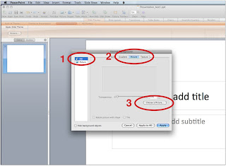
To import your background picture here go to Format, select Slide Backgound, select Fill (1) in the left column, select Picture (2) along the top bar, choose picture (3) and then Apply. This will also keep your files size down as PowerPoint will store only one copy of this image no matter how many times it is used.


Incidentally, it's okay to copy and paste images from one slide to another within your PowerPoint show. PowerPoint again stores only one copy of the image no matter how many times you use it, so reusing an image can actually help keep your file sizes down.


By using the suggestions above, you can help to keep your PowerPoint files lean, emailable and efficient. Of course... converting your PowerPoint presentation to video also reduces file size AND also has many other benefits:


  1. Enable you to view your PowerPoint presentations without the need of MS PowerPoint. Windows Media Player would be OK.
  2. Podcast PowerPoint slide show to iTunes or your own blog for sharing.
  3. Show your PowerPoint presentations on YouTube, Google Video, etc.
  4. Review PowerPoint presentations on iPod/iPhone/Pocket PC.
  5. Create mp4 video and view PowerPoint presentation on TV.


But, that’s another blog for another day...

Thursday, September 17, 2009

I've got logo design on my mind...

The world is running rampant with logos. For inspiration I usually hit the web for some visual cues. Today as I was ‘researching’, my mind automatically started to classify the logos I saw into groups or logo types and I thought I would share. 


Everyone is familiar with your basic wordmark logo. These logos use unique typographical treatments to communicate the brand’s message or positioning. When done thoughtfully, wordmarks can leave a definite impression.

Using a letter or letters as a symbol was another popular logo type. Love these.

An icon/symbol/mark is a pictorial representation. The image is usually a reference to the company, product or a brand attribute.

Abstraction uses graphical forms to convey a concept that is relevant to the brand message. Personally, I find these the most fun to design but the most difficult to sell to the client!

And finally emblems. I very rarely design this type of logo but it might be due to the nature of the brands I work on. I don't find emblems appropriate but maybe I should try!

Did I miss any?? For more great examples of logo design be sure to check out  http://creattica.com/ (where I collected these examples). Tomorrow, basic elements that make a good logo...

Tuesday, September 15, 2009

Delicious colours...

Inspiration comes from funny places sometimes. For me it's food...

Anybody that knows me well, knows how much I love to take pictures of food. I also love to make food although baking inspires me the most. I don't remember events by dates. I remember them by the food that was served.
My photos aren't of the best quality but this is how the food I bake and the pictures of my desserts inspire me...


Monday, September 14, 2009

Sacha writes things

This is embarrassing. I am part of the social media committee at BrandHealth. I spend most of my time preaching about social media to whoever will listen - and especially those who don’t want to listen. Half my life is dedicated to Facebook, MSN and Twitter... yet, this is my first blog... ever!
Do you know what’s most embarrassing? My most difficult convert to social media - Paul Hickey, President of BrandHealth – is now leading my little blog challenge 10 to 1. Gawd knows he’s probably written another one while I type this!


http://2ndfloorcorneroffice.blogspot.com/ 
Yup, he did.


Well, I’m going to have to put an end to that...  ohhh, the pressure...